Your proposal might be more visually appealing in certain cases but there is no clear visual explanation of what is going on. New users and people browsing without an account wouldn't intuitively understand that these are comments from crossposts in federated instances (what does any of this mean?)
sadschmuck
joined 3 years ago
each comment section is contained in a box with a clickable header. Clicking the header collapses the shade, leaving only the header. Kind of like collapsing a comment.
I was just suggesting this but in general.
I think this would be visually overwhelming
Piefed's implementation of this idea is a good place to start imo

Comments from crossposts are organized into sections according to each community and you can easily read a community's sidebar by clicking on the icon next to it (red arrows). I think those sections should be collapsed by default, this way it would be harder for users not to notice that these are comments from a different community.
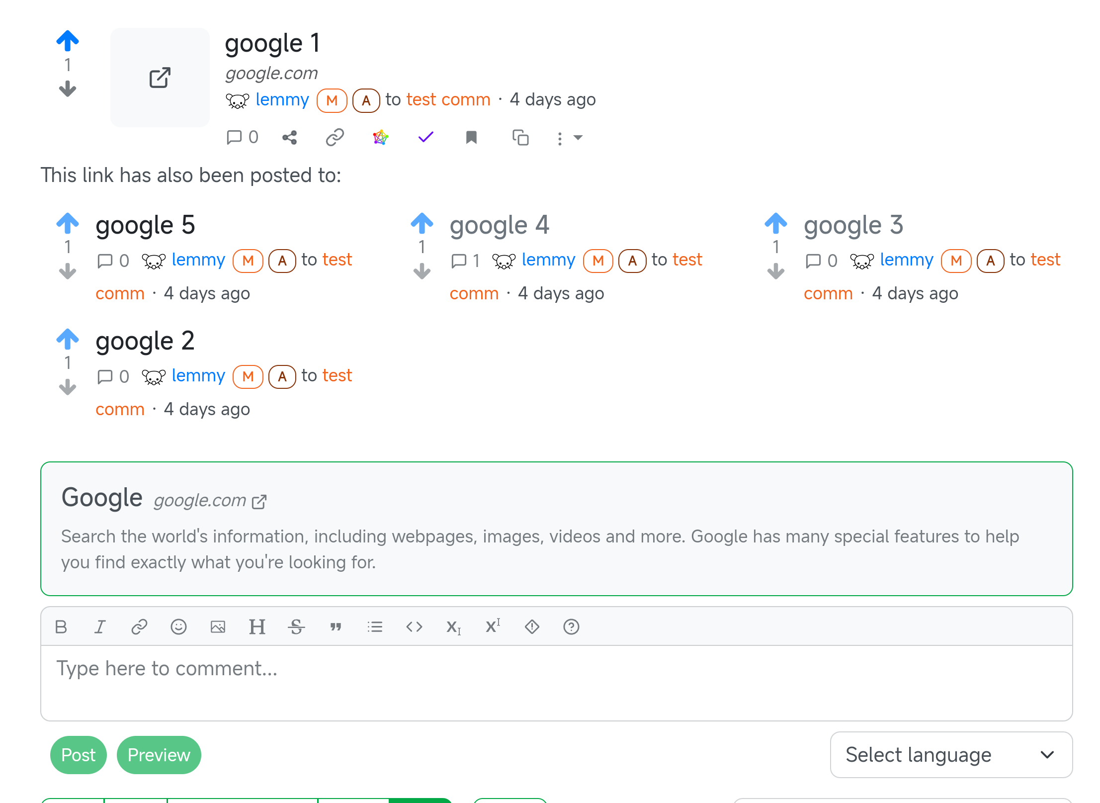
Here is something to consider, sometimes one link is posted multiple times to the same community, how would you deal with that?
Edit: When a user wants to reply to a comment from a crosspost there should be a reminder/indicator that this is a comment from a different community or something.
I made this suggestion recently. Have you seen the Piefed implementation though? You can see an example of it here.
The undemocratic overthrow of the Soviet Union is what happened, and the imperialists won and got to plunder those countries and... shit sucks.
Any thoughts on this analysis by zei squirrel? https://x.com/zei_squirrel/status/1933793088255741979
Thanks comrade 
Or for the new crosspost display to be collpased by default.
And how much space would this take on mobile?