this post was submitted on 25 Sep 2023
1 points (100.0% liked)

Comic Strips

18366 readers
2386 users here now

Comic Strips is a community for those who love comic stories.

The rules are simple:

Web of links

founded 2 years ago
MODERATORS
top 13 comments
sorted by: hot top controversial new old
[–] Rentlar@lemmy.ca 0 points 2 years ago (1 children)

Who writes TODAY in All capitals on paper?

What happens more often is my sloppy 6 and 0 look too similar.

[–] megane_kun@lemm.ee 1 points 2 years ago* (last edited 2 years ago) (1 children)

I've picked up a habit to (sometimes) write in all caps. On the flipside, I've picked up some strategies to differentiate letters and numbers from each other:

  • 1 would have the top serif if it needs to be differentiated from lowercase l.
  • 2 would start like a question mark, and then continuing on with a horizontal line, something like: ʔ︭
  • 5 would be written in two separate strokes, the top one from left to right, and the second from top-left straight down, then a semi-circle going clockwise
  • 6 would be written in one smooth stroke from top-right going counter-clockwise down, then up halfway, then intersecting itself at the bottom rather than bottom-left. (Kinda like φ)
  • 7 would have the middle bar (differentiating it from a 1)
  • 9 would have two strokes, first is a loop starting from top-right counter-clockwise almost meeting itself; second stroke goes from where the first one ends straight down-left-ish
  • 0 would have a light stroke going from top-right to bottom-left
  • D would be two strokes, kinda like this: |>
  • I would have the top and bottom serifs
  • J would have its top serif and its tail emphasized and angular, kinda like this: ˧˩̅ (I really hope the unicode characters show up properly)
  • S would have its upper part smaller, and its lower part larger and more emphasized, so that it'd look more like a coiled snake.
  • U would look like my lowercase u (with the right vertical downward stroke).
  • V would be written in two strokes: top-left to bottom, and top-right to bottom.
  • X is also written in two strokes: top-left to bottom-right, and top-right to bottom-left
  • Z would optionally have the middle bar (Ƶ), but it usually doesn't need it to differentiate from 2
[–] Rentlar@lemmy.ca 1 points 2 years ago

I do the bars for 7, Z and the Ø for 0 when I'm worried about confusion. D I make sure the bar is straight or concave, in two strokes.

Also my 1s and lowercase Ls are both single stroke so to differentiate I make it look more like a mirrored J.

[–] randomaccount43543@lemmy.world 0 points 2 years ago (3 children)
[–] Mac@mander.xyz 1 points 2 years ago

Missed opportunity for "5ame"

[–] LongPigFlavor@lemmy.world 1 points 2 years ago

Same, I can't write a 5 in one smooth motion, when I try to it ends up looking like an S.

[–] RQG@lemmy.world 0 points 2 years ago (1 children)

My 5s are apparently unreadable for most people. Whenever someone asks me what that sign or letter is on anything I wrote I will say it's a 5 without looking. They'll say how I didn't even look. But it's always correct.

[–] thefartographer@lemm.ee 0 points 2 years ago (1 children)

Your 5 is just a fucked up b, right?

[–] RQG@lemmy.world 0 points 2 years ago (1 children)

No, it's a 5. Idk why people don't see it.

[–] STUPIDVIPGUY@lemmy.world 0 points 2 years ago (1 children)

attach pic of your 5 and let lemmy judge

[–] RQG@lemmy.world 1 points 2 years ago (1 children)
[–] STUPIDVIPGUY@lemmy.world 0 points 2 years ago* (last edited 2 years ago) (1 children)

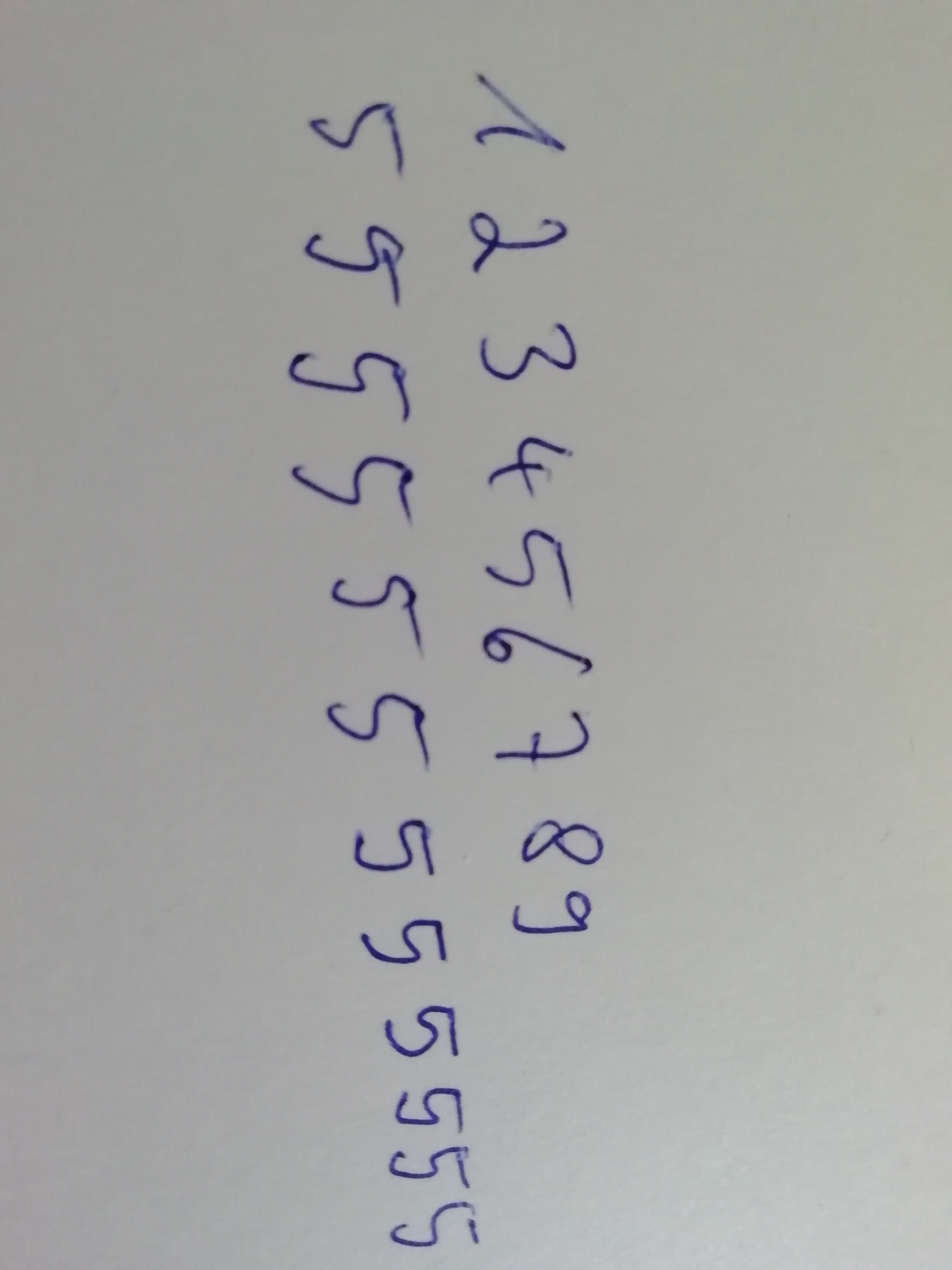
yeah kinda messy I rate 5/10

here's my suggestion for making it less ambiguous

[–] RQG@lemmy.world 1 points 2 years ago

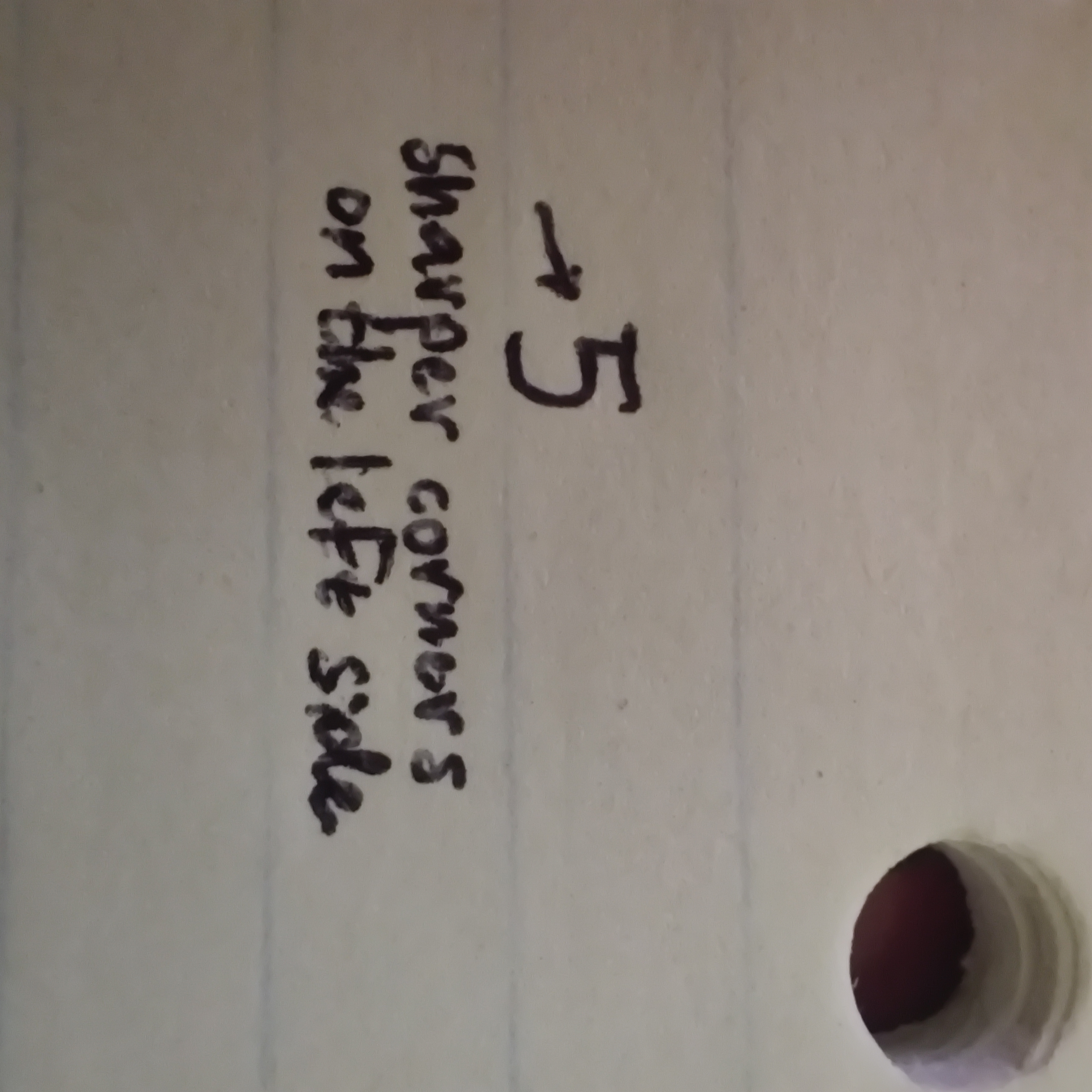
That's still a 5 out of 10 though.