Book
Marks
Down
Loads
For
Ward
Re
Fresh
A place to discuss the news and latest developments on the open-source browser Firefox
Book
Marks
Down
Loads
For
Ward
Re
Fresh
It looks much better if your phone has properly set scaling

How can I set scaling ? My phone has Android 9.
At least on my devices, there's two ways of doing it, either changing the font size.
Or on lock developer settings by clicking on build number in the about phone than Software Information. Than go back into the main menu for setting and at the bottom you shoul see developer settings. Once you enter developer settings scroll to the bottom and you should set find a option called minimum width. decreasing the number makes things more compact while increasing it does the opposite. I would recommend going by small increments of 10 to 50 since going to drastic will make it very difficult to change the setting back.
Thanks! I'm gonna have a look at this.
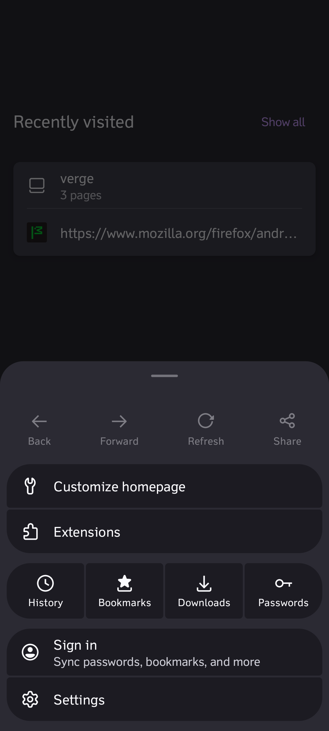
A settings menu is useful. What's the issue?
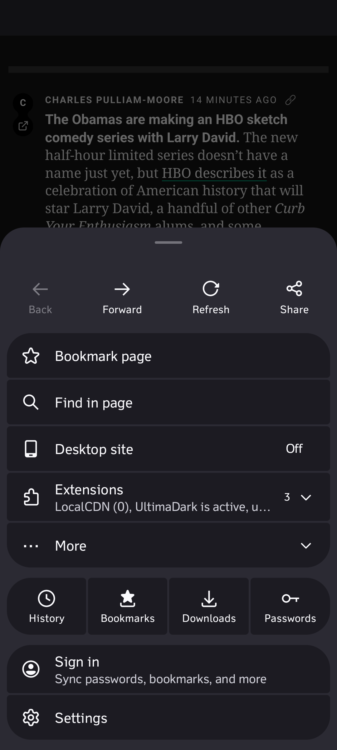
"Let's put the back, forward, reload and share buttons so distant from the open menu button that it needs to move your hand."
My phone has a gesture for back and refresh, I've never used "share" (I just copy the URL from the bar), and I only very rarely use the forward option. To open a new tab, I hit the tabs and then the new tab button (at the bottom). I put the URL bar on the bottom so everything is pretty close.
I find it very economic.
Back forward and refresh buttons don’t belong in a “More options…” menu. They belong on the main view.
Theres only so much space. You would need a whole extra row
Before the update, they where in this menu, but the menu was a simple vertical one and these options where at the bottom.
Oh, I completely agree that they should be at the bottom. I think this design would be amazing if they moved the refresh and back/forward to the bottom
I definitely prefer quicker access to the controls even with reduced viewing area. I'm normally only going to be skimming things in my phone's browser so I'm going to be frequently using the controls.
This is so annoying. Whenever I want to use page search my muscle memory clicks some random button instead. It would've been acceptable if this accomodated new features but it doesn't add anything at all and only makes it stick out from the other UI elements in the app.
The big round corner is unbelievable ugly... at least in my opinion. If right angle is not popular in modern UI, the small round corner like in URL bar is acceptable to me, but this one is too huge...